
At Neeto, we are building lots of products. As we built more and more products, we ran into the issue of UI consistency. For example, the primary button's color and size would vary from product to product. Filter features would differ from product to product. Checkboxes would look different. Labels, input fields, tabs, and other elements would look inconsistent. We started putting code in the folder to solve the problems of consistency, styling, and code duplication. This folder was shared by all the products.
This solved the problem only partially. What we needed was Neeto’s own UI library. NeetoUI is the UI library of Neeto. It makes it easier to build consistent UI across various Neeto products, and it is currently being used in more than 20 Neeto products. It’s open source. With the help of NeetoUI, we could get consistency in buttons, text, links, and other UI elements.
Building NeetoUI
NeetoUI v1
NeetoUI v1 was the first version to be released for the public on npm. We decided very early that we would be using Tailwind CSS to style our products, and hence, we quickly created a few UI components and published the package on npm. We used CRA (Create React App) as a boilerplate and craco to customize some configurations around CRA.
In NeetoUI v1, we mainly focused on extracting standard components from each product we built. NeetoUI provided too much customizability, which led to problems. Hence, we decided to create NeetoUI v2.
NeetoUI v2
In NeetoUI v2, we made several bold decisions.
We moved away from Tailwind CSS for styling UI components. In v1, we used Tailwind CSS at the package and host application levels. The host application styles often override the base styles of NeetoUI components, causing all sorts of issues. Debugging these types of problems was very time-consuming. Removing the usage of Tailwind CSS from NeetoUI solved all these issues.
We used blueprintjs for overlay components like Pane, Modal, Alert, etc. We got rid of blueprintjs too.
We also moved away from CRA and used webpack to bundle NeetoUI. This gave us more control over the whole bundling process.
Another decision was to move our color palette from Tailwind CSS base colors to a monochrome palette. One of the main reasons for using monochrome this time was that we first wished to tackle the UX aspect of products and then look into the UI aspect of it. A monochrome palette gave us the advantage of bringing in colors in the future. Our design team pitched a basic component library design system with a monochrome color palette, and we liked it. It was quickly rolled into NeetoUI.
In NeetoUI v2, we also dropped support for many introduced props due to quickly creating a component library in v1. We stuck to the base design system, which later helped us make sure that all products dealt with actions in a consistent manner.
Considering this, we successfully released NeetoUI v2 without external dependency on Tailwind CSS, blueprint, or any other component library. There were a few exceptions. We had decided that for a few components like DatePicker, we would not be writing custom components from scratch; instead, we would be overriding the styles of an external library. The only external dependency that we had on an external component library in NeetoUI v2 was antD, and that was because antD provided us with the perfect components for DatePicker and other date-time-related components.
In NeetoUI v2, we started using Storybook to document all our components.
NeetoUI v3
NeetoUI v3 was a cleanup release. We made cosmetic changes along with some performance enhancements and made sure that the components would be scalable for the future.
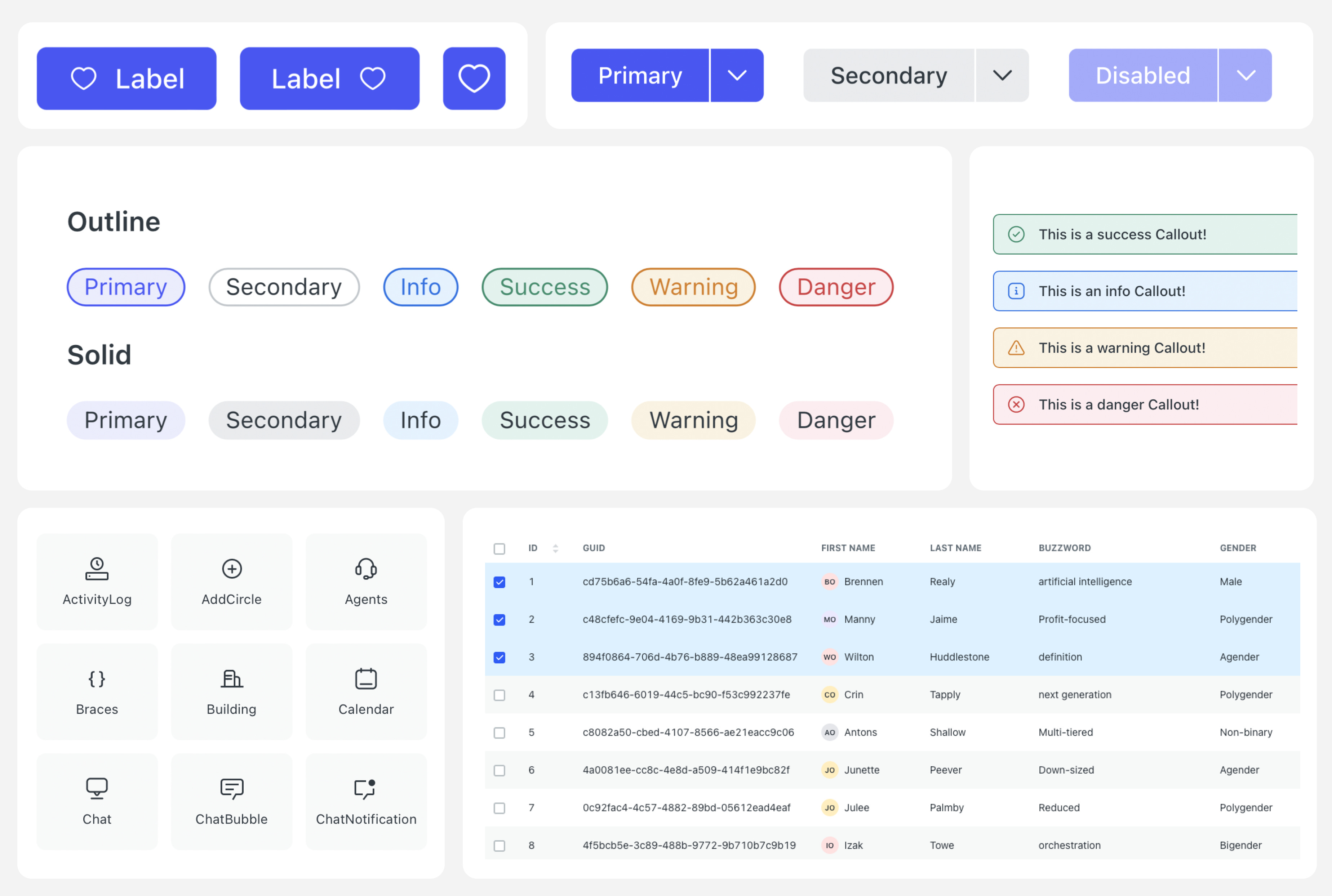
We had reached a stage in product development where NeetoUI was being used consistently across all the products without any unwanted overrides. In v3, we decided to introduce a base color palette for NeetoUI and moved away from the monochrome palette added in v2. We introduced new primary, secondary, and tertiary colors, pastel colors, and shades of grey ranging from 100 to 800. This enhanced the UI of all products. The change in the color palette was not a breaking change, and almost all products switched to v3 in no time except for the ones that needed component-level style customizability.
V3 was also when we were rethinking our bundling process. We looked around for better tools and landed upon rollup.js. We did a quick POC and realized that rollup was superior to our webpack config. Tree shaking, bundling time, and the ease of configuration made it the perfect fit for our new choice of bundler. Using rollup.js reduced our bundle size by quite a considerable margin.
Since NeetoUI was being used in all Neeto products for all the UI elements, a bug in NeetoUI or a change in logic could break multiple products simultaneously in a single release. Hence, we decided to write tests for all the NeetoUI, no matter how small the component usage is in the host products. We used jest and react-testing-library to write the unit tests. We added GitHub actions to ensure that any pull request would run these tests. This ensured that post v3, no changes in NeetoUI brought any unknown bug in any of the Neeto products.
NeetoUI v4
The NeetoUI v4 release focused on design systems, design tokens, a11y, semantics, and scalable solutions.
Although we had been maintaining a design system, we noticed inconsistencies between NeetoUI components and their corresponding designs in Figma. This was mainly due to delays in updating Figma files after changes were made in NeetoUI. We faced conflicts in terms of design tokens, color palettes, and component naming conventions between the UI and UX teams. However, we were able to build a design system from scratch that built NeetoUI v4 in a month.
With a solid design system ready, the NeetoUI team started pixel-perfecting every component. We were also keen on introducing a11y and semantics and hence, we started off with the basics of making sure that all elements can be tabbed through, making sure that focus is trapped within an overlay, and much more.
Since the release of NeetoUI, we have received multiple requests to allow for the theming of the color palette from the host application. In v4, we introduced CSS variables powered by SCSS files, which allowed users to customize any color from the palette to fit their needs. This means that users no longer need to overwrite all CSS class names if they want to change the primary color to their brand palette; they can override the CSS variable for NeetoUI's primary color.
Till v4, NeetoUI didn’t work well with IDEs. We had auto-completion support only for component names. To fix this, we added .d.ts files in which we defined the component data types. It significantly helped improve IntelliSense and autocompletion of component props served from the package.
NeetoUI is our dedicated UI library, providing a consistent and scalable UI design across all our products. Our journey from NeetoUI v1 to v4 has been full of learning experiences, and we are very happy with what we have built. With NeetoUI, we are confident that we can continue to deliver exceptional user experiences to all our users.
NeetoUI is open source. Check out the docs, and please let us know what you think of it. In the coming weeks and months, we’ll add more resources to make it easier to start with NeetoUI.
Ready to try Neeto?
Let's get started now.